 I've grown to love comics. As a child, I would run to the dining table every Sunday and shove my younger brother other out of the way just so I could obtain a piece of the funnies from the Journal Sentinel. In elementary school, I drew animated characters in my nonfiction short stories. And in middle school, I contributed comic strips to the school's paper. I don't think it's any surprise that I'm covering the topic for The Plain Dealer. And from exploring its page, Ohio’s news source reminded me of my childhood again.
The cartoon strips can be found under the "Entertainment" section. It made sense. But from messing around with a not-as-good source last semester, I have this habit of searching for things on Google first. I didn't think it would be so easy to find the cartoons. But I clicked the "Comics" label and it led me to a page called "Comics Kingdom." I wasn't really impressed with the format at first. A description of what "Comics Kingdom" was about occupied the right middle portion of the page. But on the left side, there was a big discount advertisement splat in the middle of the page. It wasn't as artistic as I thought it was going to be. You can scroll down and see all the art behind the ads, but still. An editor needs to make the page more exciting. The section also has "Featured Comics" that include all the ones that I used to read as a kid. "Between Friends." "Marvin." "Beetle Bailey." Then I saw what I would study into further detail: "Curtis," a favorite strip my brother and I read. "Let's see if Curtis and his brother still talks about women and their hats in church behind their backs," I said with a snort. I was again led to a page where the editors had a description summary of the comic strip and an ad to the left. It was annoying: I expected a drawing of Curtis to be at the top. But by scanning through, I was able to find the strips. The images were crisp, bright, and had way more color than from what I could remember looking at back in the day. You don't have to squint or anything toward the photos because they look as though they're in high definition. Ohio also allows you the option of tweeting or Facebook liking the comic strip. There's even a comment section below. And people actually respond back to the content that the artist publishes. I'm happy that the source put in a comment section where people can share how they feel about the entertainment. It helps guarantee that there's someone out there who may have the same type of feelings I have about each artistic publication. Being able to read the comic section was a great way to close the semester's beat. I'll return to the comic page soon. I can see that I have a lot of catching up to do with the funnies.
0 Comments
 Finals week is the most stressful week of the semester in college. And during that type of week, there are times where I just don't want to think about papers or exams. To take my mind off of the stress, I watch television. I dance around in my room. Sometimes I accidently do start thinking about what my grades could be and crawl into a fetal position in a dark corner. I also listen to music as a relaxation method. And finishing up my second-to-last extra credit blog for The Plain Dealer, I hoped that TPD would help calm me in some way through media. I decided to step away from Pandora and see what the news source had. I left the site disappointed.
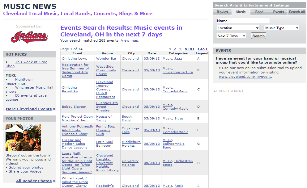
I had no difficulty getting to the music page. Go to Cleveland.com's original website and scroll down until you see a "Community Center" area. The section I looked at was called "Find music." I liked how the editors split up the area by genre, region and what amount of days or months I was looking at for the latest music. I decided to try it out, first picking out the genre "Pop." I then looked in the region area. Ohio was very good at labeling its own areas out. It ranged from Akron, Ohio, to Wooster, Ohio. I was bummed out but not surprised that the source focused on music from its hometown. But I stayed hopeful, thinking that Cleveland had some good underground artists I could listen to. Nope. The page turned out to be just updates on music events; local music, concerts and bands. I came here for pop on demand. But Ohio gave me out-of-state gigs. There are 14 pages full of content and events that are happening such as who is performing and on what day. And don't get me started on that "Legend" section in the corner. I had no idea what that was. The page aimed toward people who have much more concert experience within Ohio. I don’t live there, so I had no idea who any of these performers were. I also just wanted some streaming music but did not obtain it. Sigh: back to Pandora. Thanks, TPD.  Yes. The semester is coming to a close. Students are running around and pulling out their hair from all the last-minute assignments right before finals that professors threw their way. Seniors are upset that they're getting closer to interacting with the real world than other college pupils. And I'm creating my final blog post about The Plain Dealer beat that I was assigned to at the start of the spring 2013 semester.
Actually I have one or two more left for extra credit purposes, so this isn't my last blog post. But I'll make it sound as though it is. I remember the week that I got my new beat. I hoped that it wasn't as bad as my other one. It wasn't. TPD came out swinging and ready to prove that it wasn't like any other amateur news source. Sure, nothing changed since I started studying the site. On one account I found that interesting because I noticed that another website I compared my beat to change in some way. Cleveland's page still uses the same blue tabs that BET used to use in an extensive amount on its page. You'd think Ohio would also change its news source's look in between that time. The site also had a difficult time contributing its own content toward issues outside of their state. The Associated Press occupied any coverage on such big issues as the inauguration and the new pope. The struggle with the paper using the external nonprofit news agency as its only source continues. But the lack of change also served as beneficial for the site. I once compared the webpage to Black Enterprise and gave Cleveland a big thumbs-up for allowing the audience access toward controlling whatever videos they want to watch. I recommended that the page keep that feature the same. I guess the editors paid attention to that suggestion. The staff also didn't just bring in AP content, either. Whenever a story developed in their area, C-Town ran to the scene. And think about it: using the AP serves is a good thing for everyone. The agency may lack pictures sometimes and include long articles. But Ohio's staff may do this in the attempt of bringing the most accurate source they can find to update their readers. That, my friends, is ideal. I compliment the writers for all of the work they put toward giving their audience the best information possible through the lack of change. It's probably because the editors noticed that I put up so many positive comments about their site that they've decided to let it be. Or they didn't read my posts. That's cool. Not really. I've found a handful of flaws from The Cleve's page. But I wouldn't do the source justice if I didn't mention how dedicated it is to its area. Good job, Cleveland. 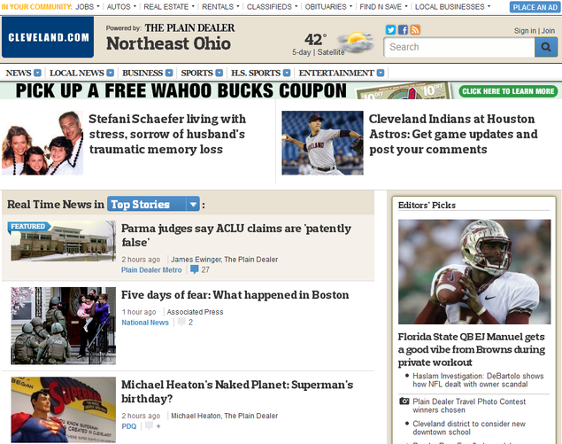 Tragedy struck in Boston Monday during an annual running marathon. You better believe that every news source was on it when the incident happened. Yahoo. CNN. Every single one of them. So it surprised me a little bit when I saw that The Plain Dealer didn't also bombard itself with updates and information on the incident. Perhaps it's because I didn't look at my beat until this weekend. Perhaps it's because the issue happened in a different state. But that shouldn't be an excuse. Other sites that covered the issue focus on national news. They don't spend time on just one particular state. Yet they still covered the marathon to an extensive amount: so why not TPD?
On Ohio's front page, the only article that I saw today was "Five Days of Fear: What Happened In Boston." Click on it and you'll see five Boston-Marathon-related articles to the right of the article in a separate box. On the right you'd see the number of Facebook "likes" and tweets each article gained. Two people liked the article from Facebook and one individual put it up on Twitter. The article written was long, too, with no pictures or any sort of multimedia. What made the circumstance worse: the content didn't consist of original work. The Associated Press wrote it. I didn't want to read it at all. I'm serious. Take a look: only one photo is in the piece. The editors should’ve broken up the piece a lot more. There's also only two comments under the article. That indicated to me that the people in Cleveland don’t really care about the problem at hand. Not only that, but the Boston story wasn't considered the top ranked. Above the piece on the front page, there's an article that reads "ACLU claims patently false." The city is basically telling me right now that some jail issue is more important than what happened in Boston. Nice. As you scroll down the page, you see one more article: "Boston Top Cop: Bombers likely sought more attacks." But other than that, that's it for the state. Not even the opinion columnists had anything to say Sunday morning. Most comments were directed toward the NFL. Ohio must really not give two craps about Boston. I really hope that I missed something based on what I've seen. The Boston Marathon was not really covered that well by The Plain Dealer. Yes, on TPD's Facebook page there is more information: about four or five more posts, but those were basically written on Friday. When you get past the end of the week, it's as though nothing happened that fateful day in Boston. Not the news source's best day.  Mira Lowe came and talked to students of JOUR 2100. Follow her. She gives great advice to aspiring writers. As everyone should know, South Korean rapper Psy's new single called "Gentleman" over the weekend. I decided to try something different and look at CNN's website for the story because I remembered from class that the senior editor for features on CNN Digital Mira Lowe said that she wanted the site to obtain a reputation for one that you come to for everything, no matter how big or small the story. Lowe went into the explanation of the issue and many other points during her Wednesday visit to our JOUR 2100's class.
The CNN digital editor first thanked everyone for their suggestions and comments on the pages she worked with. The pages include entertainment, tech, health, living and travel. She found out from the feedback that the Living and Travel sections needed more pictures. But the students described the stories as "well-done and relatable." Lowe also taught the class some typical jargon used in online journalism: "T's" meant top story and "C's" meant the center story on a cover. She defined "verticals" as the categories within the row above the CNN title. Then the digital editor let the students in on a little secret in regard to the site's viewer statistics. From the homepage to money verticals and any others in between, men dominated as the top readers of CNN's website. "Our site over all the dominance is males," Lowe said. "We're trying to figure out why that is." She said that software came down to the realization of the statistics. "There is a lot of software that allows you to track," Lowe said. "We rely on the research department and they figure [the stats] out for us." But Lowe gave the suggestion that the results came from the homepage. "If the homepage is dominantly male, the entertainment and everything else would be dominantly male. So we’re going to change that." She then went into CNN's blogs. The specific pages either update people about things that are happening within the world or focus on new areas that are usually not essential topics within CNN's content. "We have adopted the live-blogging model," Lowe said. That meant when push came to shove about whether the news source would use live-blogging or live-tweeting that CNN preferred blogging. That way CNN could provide notes and more extensive information through three or four paragraphs. We also didn't cover it within our blog posts, but the editor showed us something known as the "Trending" page. It's a useful tool on CNN for anybody who just wants to see what's going on throughout the world. "It allows us to look at what's trending on our site compared to other sites," Lowe said. Other blogs that Lowe informed the journalists about included the Belief blog and the Schools of Thought blog. They focused on religion and education respectively. Even the photo department has their own blog. The staff makes sure that the photos provide more of a background on what's happening. Yes: all of CNN's blogs came in an extensive amount. But whether the online source continued updating them was a different story. "Blogs come and go based on interest and resources," Lowe explained. "There may be others that we want to play on based on these factors." Lowe ended with advice in reference to the students moving on further within their journalism careers. She said that a writer, just as CNN tries doing every day, should pay attention to voice, insight and the information supplied. "The channels: that has been our focus on not just the news but from the person's point of view," She said. "Focusing on the people is something that we're trying to do." The editor ended with a CNN video known as "The Gift of Charles," a clip about a teenage son's relationship with his family as he was dying. She emphasized the personal stories and the emotions from the characters as examples of what the students should include in their own multimedia packages with their own interviewees. "If it’s compelling enough and you have the content to carry," she said, "people will watch it." Lowe was right: having compelling information is key. Looking for the Psy story, I scrolled through the entertainment section just to see if CNN had Psy there, and the page did. The article implicated to me that CNN is trying to bring in people of all backgrounds, ages and interests with all types of packages including photo galleries or videos on well-known people. Maybe I'll look at CNN more often. And perhaps if I focus my writing and multimedia on deep and personal stories and include an international perspective now and then, I could reach as big of an audience as the news source. I wish the best with your future content, CNN. Prepare yourself for Wednesday, folks. Mira Lowe, senior editor for features on CNN Digital, plans on stopping by JOUR 2100 for a visit. Our professor instructed that the following blog post be based on the CNN sites that Lowe works with and compare them to our own beat. The pages include entertainment, tech, health, living and travel. From what I saw, CNN had similar issues as with The Plain Dealer. But TPD still needed to bow down before all of CNN’s glory.
I looked at the entertainment section first. My beat had its stories on movies in theaters. But any other content stayed on such things as local rock concerts, expensive food and bars. I didn’t have the interest, money or age for any of that. On CNN’s Entertainment page, I found it great that the editors included stories about national stars. It was fascinating to see celebrities strutting around and engaging in activities as any average person. I also enjoyed the photo gallery on the left side of the page. But it wasn’t so nice that I wasn’t able to click on the photo and learn more about its context. Take the Kevin Hart picture on the page for example. I cannot express how much I wanted to know why Hart was walking around with what looked like 3-D breasts pasted on his black shirt. I clicked the photo but got no other information. Disappointment came over me: I wanted more insight. Now I found a tech page under Cleveland’s website, but I’m not sure that it was what I was looking for. I also had to search for one. That serves as a downfall for anyone who wants facts on the latest gadgets, gismos, and do-hickeys. CNN came out victorious yet again with its easy-to-find page. And I. loved. The headlines. They all made sense: no complex words or anything that would make a reader go “What is this mess?” They also all interested me by the way they were worded. “Was this Mark Zuckerberg’s first website?” I went all “Ooh. News on a recent social media icon’s past" because the headline posed a question on a current celeb that interested me.The site also differed from others through the organized and simple columns. There are basically only two, so there weren’t that many surprises. And Entertainment and Tech together had a lot less rows and columns going on than the CNN.com’s homepage. That’s great. Keep it colorful. Keep it simple. The Health page didn’t strike that much appeal within me. Everything just seemed unorganized. I’d go with the format of the CNN homepage rather than this. Ohio’s news source looked more simple with its two columns and consistent lengths. On CNN’s Health page, I couldn’t tell if some articles were really articles or just advertisements. Someone placed an Anderson Cooper ad right in the middle of the “Health Minute” row, and sponsored links appeared right above the similar colored “Health A-Z" box below. The site also consisted of a row like on my beat's page where you could get the same info on the same page if you just scrolled down. It was too much. The Living and Travel pages also served as weird for me. It looked a lot like CNN.com’s homepage, with too much content stuffed in it. I felt this was the case because I saw too many small pictures crammed next to each other, especially in the “In case you missed it” and “Travel Snapshots” area. I also ran into another small ad in the middle of the "ICYMI" and "TS" parts. The similar sizes made me think that the ad was an article itself. Other than the Health page, the other CNN sites don’t do that. These three shouldn’t either. I did like the format under "Editor’s Choice" and how there was a photo and then a headline below it all stacked together. That made me want to look at the photos first, and then read the headline. The outline right next to the center piece of the page should be the future format of two more neat columns. No matter what the approach, CNN strives at maintaining perfection. I did notice some points where my news source had its moments. But the cable news channel can sure throw a punch toward its competition with its online content. 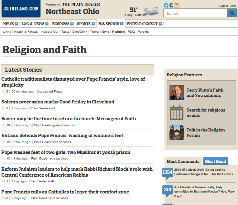 Editors make sure that they update the "Religion and Faith" page everyday. But is it of their own content? Easter has come, everyone. I'm sure you all know what that means: it’s time to hunt outside for artificial eggs that overflow with jelly beans, barf from pigging out on everything in your Easter basket, and wake up at all hours of the
morning and get ready for church. Church leads me to what today's blog post is about: religion. Keep in mind with this post that I'm not that much of a religious person. But I'll still share how I viewed the religious posts that cleveland.com offered this week. A religious individual who wants any type of coverage on the topic from the online newspaper can go to cleveland.com/religion. The page has stories from most recent to March 12. If that isn't far back enough, they have a "Browse the Archives" and "Search by Keyword" area. The files go back all the way to 2006. I scrolled down the page, scanning who the publishers were for each article, and found that either The Plain Dealer or Plain Dealer wire services produced the majority of the content. The staff only borrowed two articles from the Associated Press. The AP articles covered a "Pope Francis," a topic that popped up often under the religion page at least as late as the 12th of March. Now yes: Ohio's paper writes more articles on religion aspects. But I'm suspicious. Who is composed of this "Plain Dealer wire services" team? And how did the editors get this information about such a world issue? And looking at what type of multimedia each group supplied didn’t help my thoughts. The Plain Dealer staff offered either a slide show or high-definition picture on the issue and placed a 200-word article below the images. The two AP articles averaged around 900-words each with no pictures. And the Wire Services provided 650-word articles with a small photo: from the AP. It's great that the publishing supervisors send out at least one article to the public once a day. And yes, I did say that TPD needed more stories covered by its own people. But I'd also suggest to the individuals who run the site that they need a different approach. Going out and getting the information yourself is one thing. But something tells me that the source went out, grabbed the background story from a particular news agency, and put its own news source's name on it. Be careful, The Plain Dealer.  Cleveland.com's main focus: sports. Ah, Facebook: the main source of social media today. And like other news sources registered with the site, cleveland.com takes a piece of the promoting action. Editors post new articles for its Ohio audience at least every hour, and for good reason. It's a new era: readers today skip the actual website, go to Facebook, and catch their updates there. The comments and "like"'s usually follow. But the days I looked at the site, my prediction of such feedback backfired.
I decided to act like a regular reader and scrolled down through each post. What sparked my interest was the lack of comments and likes found on breaking news or regular news posts. Cleveland needs feedback for problems that affect the state or the world. But no. Instead, commenters didn't really comment on any other post other than those related to sports. And I also noticed that the main content that Ohio's page posted was sports. Chunks of "other" content clustered around each other made it apparent that no one cared that much about anything else. I rolled my eyes. So much for not covering anything sports-related this week. The page made it clear that that wasn't an option. Readers dodged stories like a prosecutor's office and either typed in enthusiasm toward the Cavaliers or liked shared stories about the Ohio State Buckeyes. I understand you people like basketball. But come on. But then I saw the article about "Terry Pluto's Blog: Tribe scribbles from Goodyear, where the sun has been shining on the Tribe." It's a piece on baseball: one like. A "Now is the time to impact our children's mental health: Lynn Barabach" post appears Saturday. No likes on Facebook's page. The Plain-Dealer isn't a popular news site, but it's still a site for all news. Not just sports-related news, but issues that the community really needs more of a focus on. TPD needs a new strategy to make such stories more interesting. How that can happen is the question. I suggest finding some stories that mix sports and important issues together. Focus on local basketball and how they relate to the mental health issues: anything to get someone to reflect. 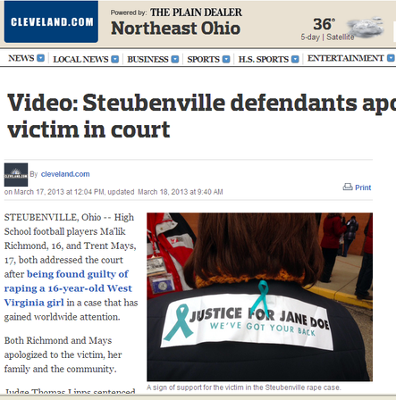 The Plain-Dealer attributes one of its videos from another source into its article. By Casby Bias
If you’ve lived on Earth for even a small period of time, you should know that there is a big drive toward multimedia, especially videos. Unlike newspapers or magazine articles, the clips provide a format where you don’t have to think too hard to come up with engaging characters and visual imagery: they’re right there in front of you. And The Plain-Dealer definitely served up its own combinations. But if the event wasn’t happening in Cleveland, the audiovisuals came from other website sources. I’d say thumbs up to the online newspaper for the films in general. From what I’ve noticed, editors placed breaking news coverage stories usually on the front page in the right-side column with the title of “Featured Multimedia.” You’d find pictures as well, but the video was where everything was at. Take for example one article I read about the recent Virginia Rape Case of a 16-year-old girl. The writers did not supply a lot of content, but, then again, they didn’t need to. The videos from an attributed site said everything. I compliment the site for putting the clips up with HD features. You could see the passion of apologizes, the emotion and breaking down of the individuals in court. Whoever made the videos tried to get as close and all up in the victims’ faces as they could. I just wish that TPD uploaded its own videos, but I’m glad the staff took the time to find qualitative clips. But Cleveland impressed me with its sports page. It was a video gallery, to put it in a few words. Game fanatics don’t have to worry about missing out on any action if they miss a game or speech from athletes or coaches. They could just check out the following link. I’m not really a fan of the hobby. But I gaped at the way Cleveland.com formatted its content. It looked like the site used Final Cut Pro. Names flashed on the left-side corner for a reasonable amount of time. Visual reporters kept it classy by including few amounts of people on the screens at a time. And either the staff committed copyright infringement and placed their own "Cleveland.com" logo on each of the videos, or the site increased in value for its own state's video footage. I compared the website to Black Enterprise Magazine, one that I usually go to for business-related news. All I can say as a response is a good job. The second online web source may have consisted of fancier graphics, but the first included the basics. The essentials included being able to stop or play the video whenever you wanted to, who the speaker was (at all times), titles that you could see, and the ability to continue on without stopping in its tracks and buffering every ten seconds. I find this beneficial for people who may not be able to hear videos at that moment and are in a rush. Excellent job, Cleveland: but try to get out within the world more for personal videos of events that are outside of your state.  The Plain-Dealer did not excel this weekend when it came to reporting on the Oscars. I don’t have a television, so I hoped that the online newspaper wouldn’t let me down. It didn’t on that aspect. I don’t know what time the awards came on, but I’m glad that the paper stuck through with its outline for where people could find information on the event. I enjoy the paper's consistency.
But coming back to the page hours later had me singing a different tune about Cleveland’s work. The format of the page turned out to be a hot mess. The information supplied during the awards was a little different now on the site. If you wanted to see all the tweets that Oscars LIVE shared, you'd have to continue scrolling down and clicking on the "Show Additional Entries" link. Do you know how many people tweeted and retweeted each minute? I'd recommend that the page consist of a permalink that moves readers to a new Twitter page. The process of reading all the tweets would still be tedious, but at least readers wouldn't have to scroll down so often. What's worse is that this live tweet event took its place smack dab in the middle of the blog that the staff posted. Imagine that you're just reading from the bottom of the blog post to the top (another thing I want to address) and bam: oh look, an ugly "Oscars LIVE" Twitter feed. That's cool. I'll just go above that to read the rest of this blog. Trust me. You'd say the same thing if you'd click on the permalink and scroll down. Don't get me started with the photo slide show put in a random area in the post. Captions would’ve helped a lot. I recognized some of the people, but others I had no idea who they were. Look: there's Adele. Now there's George Clooney. Now there's some random woman dressed in a gold dress crying on some steps. No idea who she is. Make it clear who is who, and put the photos in one place: not just one slide show and a photo gallery below it. And what is with the edited version of the Academy Awards page TPD came up with? Try reading the article from top to bottom. That's right. You can't. The staff arranged the process of the event like a Twitter feed. You'd have to read 25 percent of the article at the start, then scroll all the way down to half of the page and read up. If you want to read the comments, they're under the "Related Stories" section. I'm upset about the coverage the website provided me. It was not organized, and it just seemed like the staff threw in pictures, tweets and slide shows into a biased blog post. Thanks, Ohio. |
Meet Casby.Majoring in journalism with an entrepreneurship minor at Archives
May 2013
Categories |
 RSS Feed
