Nope; I don't feel as though The Arizona Republic is listening to me. Not much happened since I first visited the website for my first blog post beat that our professor assigned to us. The criticism I'm offering the site doesn't strike as effective either. Nothing changed except for the crazy background that the page provided viewers one morning. Remember the one with a huge football player glaring at the readers as he posed as though he would burst right from the screen? Yes; that guy.
The webpage looks a mess. The editors still split all the content up into three columns. And toward the bottom the articles become super jumbled because someone tried squeezing in rows halfway while another column design still followed a consistent outline. The breaking up of events needed a major makeover. Those who managed the page should consider that more. It's because of such disorganization that I prefer the phone application instead. One thing I noticed this time was that there is this "things to do" area plastered right in the middle of the page and highlighted in yellow in comparison to other categories with blue-highlighted material. This is good, Arizona; stick with this type of design. In fact, if "things to do" is an important aspect, the online newspaper should bring it to the top. But the "things to do" area also started one specific pattern that upset me. Clicking the "most popular" link, I scrolled down and found this category was repeated further down the page. But that wasn't the only set of events repeated. The first topic under the "Money" category read "Smaller cheaper Galaxy X III." Later down the page there was a new "Money" category. It read "Smaller cheaper Galaxy X III." Sigh. That's sad. The site just filled up with information that editors already stated. The online medium needs more attention toward things already emphasized. And don't forget that the page requires better organization for outlining their content. Tisk, tisk, The Arizona Republic; it's not a good digital journalism day for you.
0 Comments
Professor Lowe recently sent a reminder to his students about the assignments due on Wednesday. One included writing another blog post based on a website that he gave each undergraduate for further analyzation throughout the semester. This week students needed something from their sites that “screamed digital journalism” to them.
As soon as I saw that comment, I gripped my computer screen and shook it. "There is nothing that screams digital journalism for my page!" I yelled. And it’s true: past blog posts I created for the news source that the professor reserved for me, The Arizona Republic, implied that my news source didn’t have anything to "scream" about. Pixilated photos dominated the internet site. Editors just put one disorganized mess into three columns. And today the webpage had an issue where an error page would pop up after every five minutes. Or maybe my computer or the service I received just acted up again. But still: I saw no chance of finding something good within this content. I then scrolled down and looked on the right side of my screen: it read, "Get AZCentral anywhere." I remembered looking at the website through my phone one time, and how much easier looking up information was there than on a computer. So I grabbed my phone and started scrolling. It's great that the web editors kept everything the same yet introduced it in a different fashion. The designers could’ve worked more on the organization of which type of news would come next ("More News" shouldn't be right before "sports" and "community news"). But only one advertisement placed right above the azcentral.com logo popped up in a narrow horizontal row. No two confusing rows that you could click on for information came up. And my Android phone didn’t have pictures until the sports section, but that made it easier for the eyes and more professional. I also looked at the Facebook and Twitter links. The Facebook group presented a nice photo with local reporters as the cover picture. The quality of the pictures from scrolling down on the page: great. There was this one image of macaroni and cheese: elbow noodles were glossed over with white mozzarella, a thick layer of cheese and breadcrumbs sprinkled on the top. Yes I did eat macaroni and cheese that night. For Twitter, nothing too distracting was in the background: a simple logo and information about the Facebook and Pinterest page was placed in the top left corner. And tweets engaged their followers. The site asked questions and requested that people send back responses. Only a couple of people responded to those kinds of posts, but hey: that's a start. Yes: the site has its flaws. But the different access opportunities and social media ways that the source provided information served as great examples of digital journalism. I'm happy that something good came out of the source. 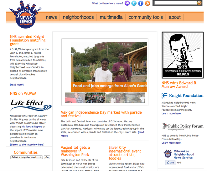 The Milwaukee Neighborhood News Service didn’t lie when it implied that it advocated for the community. For those who have no idea what I’m talking about, this source is a website dedicated to news within Milwaukee. Editor Sharon McGowan discussed a little more about the site Wednesday. At the end of class our professor gave us the task of studying it. This may be the first blog post I write for this class that makes me look like a positive person.
Now, I’m one of those people who don’t watch or read the news a lot because stations and publishers offer nothing but negative crap. This news source is different because it represents itself as a positive media sensation. I heard of how this page portrayed our community long before the editor set foot into our class. The purpose of its creation moved me so much that I temporarily worked with the objective source. Oh: did I forget to mention that? Pause. It’s true: I got involved with the project. The mix of multimedia and creating awareness about social justice issues fascinated me. I remember one article on the Milwaukee Public Theatre that I helped contribute toward. I admired its commitment toward stopping ableism by giving people with disabilities a chance at performing in front of audiences as actors, artists and musicians. And I gapped at how posts went up about programs such as TeamUp College Access Center (the author of the article is pretty cool, too) that helped residents prepare for college. The site also introduced quality photography. The carousel presented pictures of children smiling, putting readers in positive moods. Another photo exhibited Hispanic flags, stuck on motorcycles, flapping and providing a distinguished sense of place. In the newsroom, people go out of their way in making sure they choose a nice image for their articles. Shoot: I'm not mad at writers for this. It helps improve Milwaukee's appearance more if you put up a nice illustration for readers. And the community could even send in their own articles for publication. Awesome. The online media’s focus on these inspirational stories really presented Milwaukee as a positive influence: I thank the creator for thinking up of such an idea. This type of communication is an ideal model of community journalism. 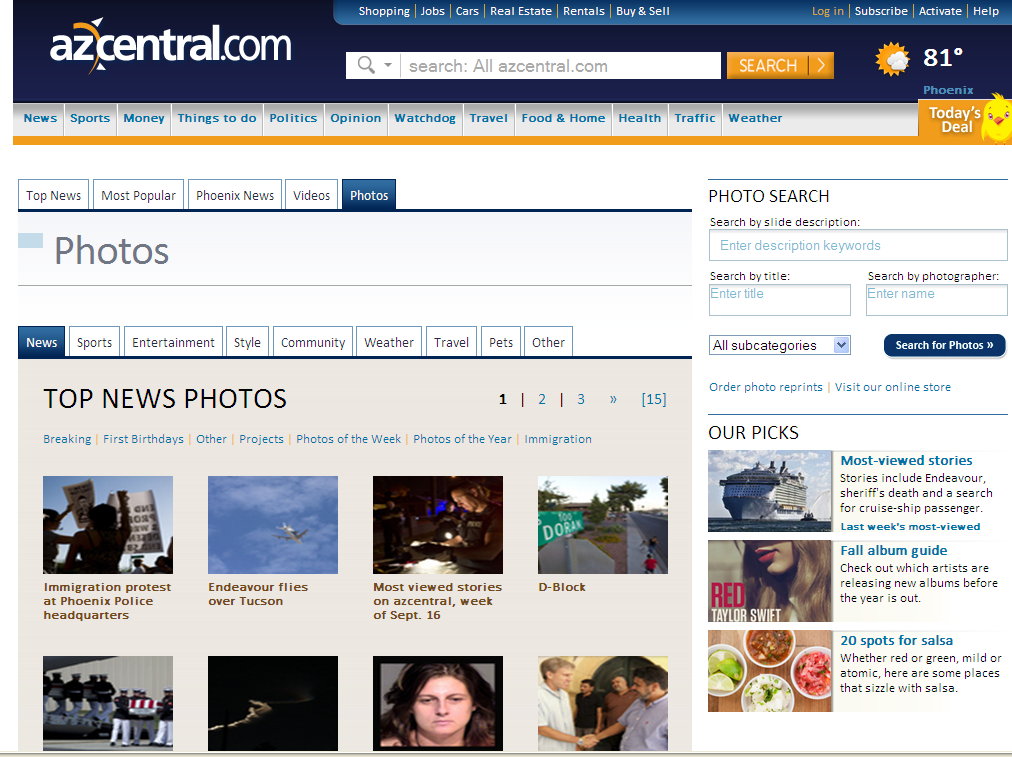 The digital journalism II class received a new mission from Professor Lowe Wednesday. Students studied the photography and audio on the website that Professor Lowe assigned to us early in the beginning of the semester. The task concerned me because I based my last blogs about The Arizona Republic on their lack of quality technology usage. The website failed at hitting satisfactory levels. But again I studied what it presented.
The online newspaper provided OK results at first. In one photo, you could see the creases by a man's eyes as he grinned. His sense of place, a stitched symbol of Arizona State University, gleamed from his maroon-colored shirt. Advertisements represented itself even better than the photos the site gave: Arizona editors didn't create the ads. You can't just switch from taking average photos of people to making pieces of what looks like a girl from the nose down, breathing out the word 'Red' in bright letters and produce a focal point from her crimson-stained mouth. I then noticed that when clicking one of the pictures under the photo tab that one had a bug crawling up a little girl's sleeve. Of course I thought "ew, gross" and then tried to zoom in to look at it some more. But the page didn't allow me access to zoom in any farther. The page left me angry with only receiving a pixilated photo and hungry for answers of what type of big bug that girl had on her shirt. But I kept at my assignment and ended up moving on to sound, immediately clicking on the video tab. The page did a pretty good job covering this. But midway through watching a video the thought hit me: video mixes audio with movement. And the professor asked for audio only. In comparison to the New York Times "One in 8 Million" series, New York Times occupied more experience with mixing pictures with audio. But The Arizona Republic didn't do this: they just had audio mixed with moving graphics. But hey, I can't point out anything really wrong with the videos. Do these pieces count for audio? I'd recommend no one fix them then. This served as a strong suit for Arizona's page. Why fix what's not broken? Again, not Arizona's best day. Maybe it will get better in the future. Maybe. Oh; and I went back and clicked on the pixilated picture of the girl and the bug. It led me to a set of clear photos, including the one that I started looking at. Again, the news source needs a separate editor for fixing up these fuzzy images for readers; not everyone will continue searching for clear illustrations. But the bug was a grasshopper: quite an ugly looking critter. 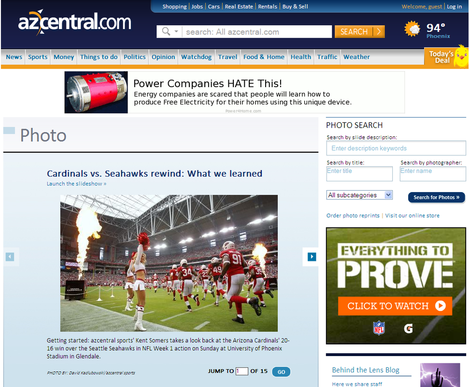
Guess who is not a fan of sports and has two thumbs: this girl.
I might watch a game if it’s a final event: but only if I’m with my family or closest friends. With that said, I was irritated in finding out that I had to give this subject my undivided attention last week. The digital journalism class had to see how our assigned websites covered the NFL. As if I wasn’t disappointed enough with my first impression of The Arizona Republic: now I had to watch a boring physical activity. But I was pleased to see that the online newspaper covered the event well. Someone even fixed the webpage’s background. A horizontal design looked way much better than a vertical one with an angry football player staring at you. It’s as though someone read my blog. (Me looking around the room slowly, creeped out) Anyway, the site started posting articles that related to the NFL Sunday before 10 p.m., but I waited until Monday for full-coverage. The “Top News” tab featured a link to insights on the win. The link wasn’t labeled as the first article, but it was highlighted at the bottom of the carousel. Highlighted news should stay at the top in the future. Below the story, The Arizona Republic dedicated an area on the left-hand side specifically for sports. It was a little area, but the yellow line above the “sports” news title helped attract visitors’ eyes. And the newspaper did more than cover the game. It also included other football game plays within the area: even a little high school football. Arizona sure likes their football. Clicking on the link under “Top News” sent me to a set of pictures. Descriptions underneath the photos told people what happened in that instance of the game. I couldn’t understand any of the football jargon that the editors typed for each description (what the heck is an “Arizona 13”?), but whoever the photographer was did a good job at capturing the excitement and pain that the players experienced. And the act of the newspapers telling fans about every important part of the game through a multimedia perspective screamed innovation. There is nothing more powerful than showing what a team endured and how it celebrated a victory through words and pictures. Priceless. The only other recommendation I’d suggest would be that the page includes Twitter updates in the right column of their main page. I don’t have a lot of access to a TV during the school year, so it would’ve been helpful to get the details on what was happening on one side of the computer screen while I waited for new appearing sport articles. The Arizona Republic Twitter page shouldn’t tell fans they could find sport information from clicking on Arizona Central’s social media link and then one random man’s account. I’m just saying: make it a little easier for the viewers.  What…
Oh. Hello there. I’m just reacting to the website that I will be reporting on for the semester. The Digital Journalism 2 Class at Marquette University now writes weekly blogs about sites that our professor, Mr. Lowe, assigned to us. Somehow I ended up with The Arizona Republic. As I said before: what? What in the world is in Arizona? But I ended up investigating: I wanted insight on all that the online newspaper offered. I clicked on the provided link...and it looked like a crammed spam webpage. Lots of advertisements flashed, and the headlines weren’t appealing unless they were, unfortunately, about death. With the type of technology today, this outline was not acceptable. The format made me think that the site just started. But no. So shame on this news media-source. But hey: let's shift to a positive route. If I said everything I wanted to say all the time, I wouldn't have any friends. Everything was easy to click on. There were two rows of information separated from each other, so people have the option of deciding which one to choose from. But I recommend both come together in the future for less confusion. The photos looked nice and crisp. I'd pay attention though after clicking the main photo tab. It looks like pixelated pictures. Also, I'd add more photos to articles. And the videos featured up-to-date qualities: you could make the video fit your screen. If you wanted to make a comment on anything on the website, you would have to subscribe. So a high-five (fist bump, etc.) goes out to Arizona for how it handled the rules about comments. If you scrolled down to the bottom of the page, you couldn’t give your opinion unless you subscribed: just like a professional website. And don't think about saying anything crazy, either: that behavior is not "tolerated," the website stated. Subscribers risk their suspension. Content was just as a journalist should write: objective and focused on the story. Well, we'll see how The Arizona Republic improves later throughout the semester. I do see some good intentions taken from the layout and content. But hopefully next time Arizona remembers to put a little bit more 'makeup' on. |
Meet Casby.Majoring in journalism with an entrepreneurship minor at Archives
May 2013
Categories |


 RSS Feed
